Contrasting borders are a clever way to define and emphasize different zones in large rooms. By using bold patterns or vivid colors, you create visual boundaries that help organize space while adding style. Geometric or organic designs can evoke specific moods or cultural messages, guiding your experience and perception of each area. When you choose complementary borders, they add harmony and clarity. Stay with us to discover how tailoring border styles transforms your space into a cohesive, vibrant environment.
Key Takeaways
- Contrasting borders create visual boundaries that clearly define and distinguish different zones within large rooms.
- Pattern and color contrasts in borders emphasize specific areas, guiding spatial perception and movement.
- Geometric versus organic border designs evoke different moods, highlighting functional or aesthetic zones.
- Bold color contrasts in borders enhance recognition of varied spaces and evoke emotional responses.
- Combining contrasting border patterns maintains harmony while visually separating multiple zones effectively.

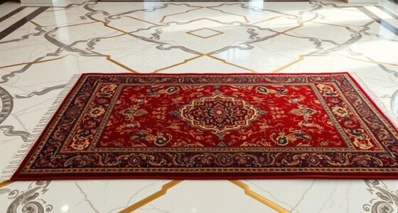
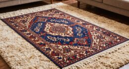
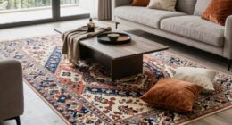
Borders often symbolize separation, but they also reveal striking contrasts between cultures, economies, and identities. When you explore large rooms divided into zones, you notice how boundary elements like border patterns and color contrasts work together to define each space. These borders aren’t just physical dividers—they tell stories about where one culture ends and another begins, subtly highlighting differences or connections. The patterns used in border design can range from intricate geometric motifs to simple stripes, each conveying a unique message. For example, a section with bold, repetitive geometric border patterns might evoke a sense of order or tradition, while a zone with more fluid, organic borders suggests openness and creativity. As you move through these spaces, the border patterns guide your eye and influence your perception of the room’s structure and purpose. Additionally, incorporating contrast ratio considerations in border design can enhance the visual separation and emphasis of each zone. Color contrasts play a fundamental role in emphasizing these zones. Bright, vivid hues sharply distinguish one area from another, creating visual boundaries that are almost impossible to ignore. If one part of the room features warm tones like reds and oranges, and the adjacent zone employs cool blues and greens, the contrast immediately signals a transition. You can almost feel the different atmospheres each zone offers—warm colors inviting energy, cool shades promoting calm. These color contrasts serve as cues, helping you orient yourself within large, open spaces. They also evoke emotional responses, reinforcing the identity of each zone without the need for words or physical barriers. By intentionally using border patterns and color contrasts, you can craft a dynamic environment in a large room. If your goal is to create zones that function independently but still feel connected, choose contrasting border patterns that complement each other visually. For instance, pairing a zigzag border pattern with a smooth, flowing one can create a lively visual rhythm, while contrasting colors further enhance this effect. You might use a bold black-and-white pattern along one boundary, and softer pastel shades on the other, to subtly differentiate while maintaining harmony. These contrasting borders help you organize the space clearly without closing it off, allowing each zone to speak its own language. In the end, borders in large rooms serve more than a decorative purpose—they’re tools for storytelling and spatial navigation. By carefully selecting border patterns and color contrasts, you shape how people experience and interpret each zone. You allow each space to maintain its unique identity while still belonging to a cohesive whole. As you design or interpret these zones, remember that borders are visual dialogues—conversations in patterns and colors—that reveal the richness of cultural, emotional, and functional differences within large, open environments.

Dundee Deco Wallpaper Border Peel and Stick BD6054 Floral White, Gray, Brown, Black Abstract Flowers Wall Border Retro Design, 15 ft x 7 in (4.57m x 17.78cm), Self Adhesive
EXTREMELY HIGH QUALITY – our decorative wall border is of perfect quality, made using only finest materials and…
As an affiliate, we earn on qualifying purchases.
As an affiliate, we earn on qualifying purchases.
Frequently Asked Questions
What Materials Are Best for Creating Contrasting Borders?
You should choose materials that offer a strong visual contrast for your borders. Paint is a popular choice, allowing you to use bold color selection and clean border techniques. For more texture, consider wallpaper or fabric trims, which add depth. Using tape or stencils can help achieve sharp lines. The key is selecting materials that stand out against your main wall color and applying border techniques for a crisp, eye-catching effect.
How Do Contrasting Borders Affect Room Perception?
Contrasting borders enhance your room’s visual balance by clearly defining zones and adding depth. They draw your eye and create a sense of structure, making space feel more organized. Using color psychology, you can choose borders that evoke energy, calm, or sophistication, influencing how you perceive the room. Overall, contrasting borders transform large spaces into inviting, well-structured environments, guiding your experience and making the room feel more harmonious.
Can Contrasting Borders Be Used in Small Rooms Effectively?
Yes, you can effectively use contrasting borders in small rooms. They create scale illusions, making the space feel larger or more defined. Opt for border patterns that aren’t overly busy to avoid overwhelming the room. By carefully choosing contrasting borders, you highlight specific zones and add visual interest without cluttering the space, making your small room feel more spacious and balanced.
What Are Common Mistakes When Designing Contrasting Borders?
When designing contrasting borders, you often make the mistake of neglecting border blending and poor color coordination. You might choose borders that clash with the wall or floor colors, creating visual chaos. To avoid this, make certain your borders complement the surrounding elements and blend smoothly into the overall design. Focus on harmonious color choices and subtle transitions, which will help your space look polished and well-coordinated instead of disjointed.
How Do Lighting Conditions Influence Border Visibility?
Lighting conditions greatly influence border visibility through lighting contrast and shadow effects. When you use bright, direct lighting, borders stand out clearly, making zones easy to identify. Conversely, low or uneven lighting diminishes contrast, causing borders to blend with surroundings. Shadow effects can either emphasize borders or obscure them, depending on placement. To optimize visibility, adjust lighting angles and intensity, ensuring borders are consistently highlighted across different lighting conditions.

Neasow Colorful Floral Tapestry Wall hanging, Bright Boho Fabric Blossom Tapestries, Multi Color Tapestry for Bedroom Home Hippie Wall Decor 50×60 inch
★Size: 50"W × 60"L (130cm×150cm)
As an affiliate, we earn on qualifying purchases.
As an affiliate, we earn on qualifying purchases.
Conclusion
As you explore contrasting borders in large rooms, you subtly guide the eye and create harmony. These gentle distinctions act as quiet invitations, encouraging movement and curiosity without overwhelming the space. When you embrace this approach, you craft environments that feel both balanced and inviting. Remember, it’s often the understated touches that leave the most lasting impression, quietly enhancing your surroundings and inviting others to appreciate the beauty in subtle contrasts.

FLFK Mirror Frame Border – Black and White Peel and Stick Wall Borders Wallpaper Decal Trim Tape Geometric Pattern 4" x 240"
Stylish Design: This peel and stick mirror frame border features an eye-catching geometric pattern in black and white,…
As an affiliate, we earn on qualifying purchases.
As an affiliate, we earn on qualifying purchases.

RoomMates York Wallcoverings Lake Forest Lodge Cabin Fever Border
Borders – Packaged and sold in single spools
As an affiliate, we earn on qualifying purchases.
As an affiliate, we earn on qualifying purchases.