
To create striking interiors with jewel-tone rugs, use complementary color schemes by pairing your rug’s vibrant hues with contrasting shades like reds, pinks, or oranges. Emerald green rugs look stunning with reds or pinks, while sapphire ones shine alongside warm yellows or oranges. Ruby-toned rugs blend beautifully with cool blues and turquoises. Balancing bold jewel tones with neutral accents and strategic accessories keeps your space harmonious—if you continue exploring, you’ll discover tips to master these vibrant contrasts perfectly.
Key Takeaways
- Pair emerald green rugs with reds or pinks for bold, vibrant contrast in interior spaces.
- Use sapphire or navy rugs with warm oranges or yellows to create striking complementary color schemes.
- Balance jewel-tone rugs with neutral walls and furniture to enhance visual harmony and prevent overwhelming the space.
- Incorporate metallic accents like gold or brass to highlight complementary colors and add visual interest.
- Regularly update accessories and decor elements to maintain a cohesive, fresh look with jewel-tone rugs and their complementary schemes.
Understanding Complementary Color Theory for Interior Design
Understanding complementary color theory is essential for creating balanced and visually appealing interior designs. When you grasp how colors interact, you can make intentional choices that enhance your space. Complementary colors sit opposite each other on the color wheel, creating contrast and vibrancy when paired. For instance, pairing emerald green with a striking red or pink can make both colors pop without overwhelming the room. This knowledge allows you to design with confidence, knowing how to balance bold accents with neutral backgrounds. Using complementary schemes helps you achieve harmony and focus, making your space feel lively yet cohesive. Whether you want subtle contrast or dramatic impact, understanding these color relationships gives you the tools to craft stunning and inviting interiors. Incorporating an awareness of cultural perceptions of color can further refine your choices, ensuring your design resonates across diverse audiences.
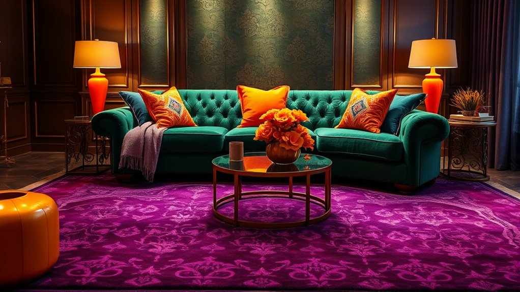
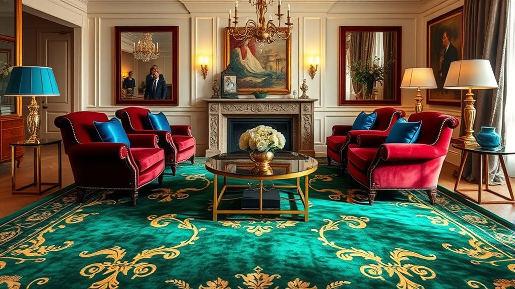
Pairing Emerald Green Rugs With Striking Reds and Pinks

Pairing emerald green rugs with striking reds and pinks creates bold contrast effects that immediately catch the eye. This combination amplifies visual depth, making your space feel more dynamic and layered. By balancing these vibrant hues, you can achieve a lively yet harmonious interior. Incorporating attention to creative practice can help you experiment with different color combinations until you find the perfect balance.
Vibrant Contrast Effects
Vibrant contrast effects come alive when you pair emerald green rugs with striking reds and pinks, creating a bold and energetic visual impact. This combination draws the eye immediately, making any room feel lively and dynamic. Reds and pinks are warm, passionate hues that pop against the cool, lush tone of emerald green. Use this contrast to highlight focal points or add excitement to a space. For example, a vivid pink throw pillow on an emerald green rug can energize your seating area. Keep accessories minimal to let the colors stand out or balance the palette with subtle neutral accents. This pairing is perfect for making a statement, infusing your decor with vibrant personality and a sense of lively sophistication. Additionally, incorporating color accuracy ensures that these bold hues appear vivid and true to life, enhancing the overall visual impact.
Enhancing Visual Depth
Building on the energetic contrast of emerald green rugs with reds and pinks, you can enhance the sense of depth in your space by carefully balancing these bold hues. Use lighter shades of pink or soft blush to create visual layers that recede, giving your room more dimension. Incorporate darker reds for accent pieces or furniture to anchor the space and add richness. Vary the intensity and saturation of these colors throughout the room to prevent overwhelm and establish a natural flow. Additionally, strategically place lighting to highlight the jewel tones, creating shadows and highlights that add depth. By thoughtfully combining vibrant reds and pinks with emerald green, you craft a dynamic, layered environment that feels both lively and inviting. Incorporating natural materials such as wood or linen can further emphasize the farmhouse aesthetic while enhancing the overall depth and texture of your design.
Designing With Sapphire Rugs and Bright Oranges or Yellows
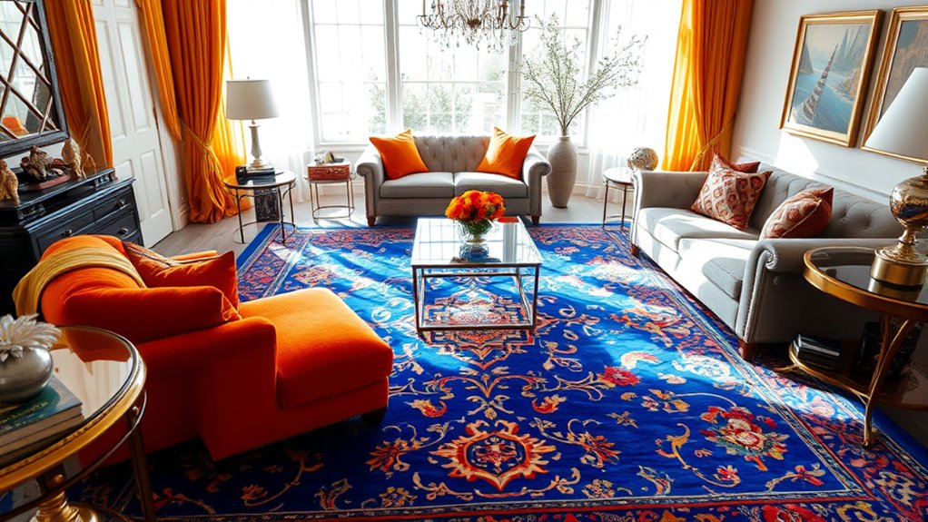
When designing with sapphire rugs and bright oranges or yellows, you create a striking contrast that energizes any space. The deep, cool tone of sapphire anchors the room, providing a rich, sophisticated base. Pair it with vibrant oranges or yellows to add warmth and excitement. To balance the boldness, keep surrounding walls and furniture neutral—think whites, creams, or light grays. Incorporate metallic accents like gold or brass to enhance the jewel-tone contrast. Textures also play a role; plush fabrics against a sleek rug amplify visual interest. This combination works best in spaces meant to inspire activity or creativity, such as living rooms or kitchens. Being aware of cybersecurity vulnerabilities during the design process can help ensure a safe and seamless shopping or decorating experience. Overall, you’re crafting a lively, dynamic atmosphere that captures attention and celebrates vivid color harmony.
Combining Amethyst Rugs With Fresh Greens and Soft Neutrals
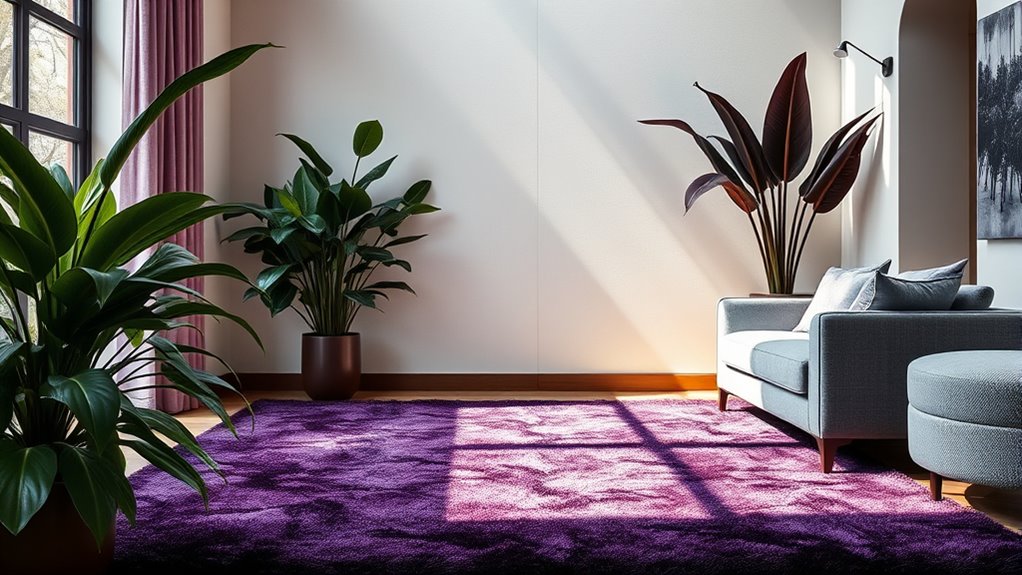
Combining amethyst rugs with fresh greens and soft neutrals creates a calming yet lively environment that balances boldness and subtlety. The rich purple hue of the rug anchors the space, while vibrant greens add a touch of nature and freshness. Soft neutrals like beige or light gray soften the overall look, ensuring the room feels welcoming and not overwhelming. You can incorporate these colors through accent pillows, curtains, or decorative accessories to enhance the scheme. This combination works well in living rooms or bedrooms where you want a soothing yet invigorating atmosphere. Keep the palette balanced by using neutral backgrounds, allowing the amethyst and green accents to stand out without clashing. The result is a harmonious, jewel-toned space that feels both elegant and inviting. Using neutral backgrounds helps create a versatile and balanced environment that highlights your accent colors effectively.
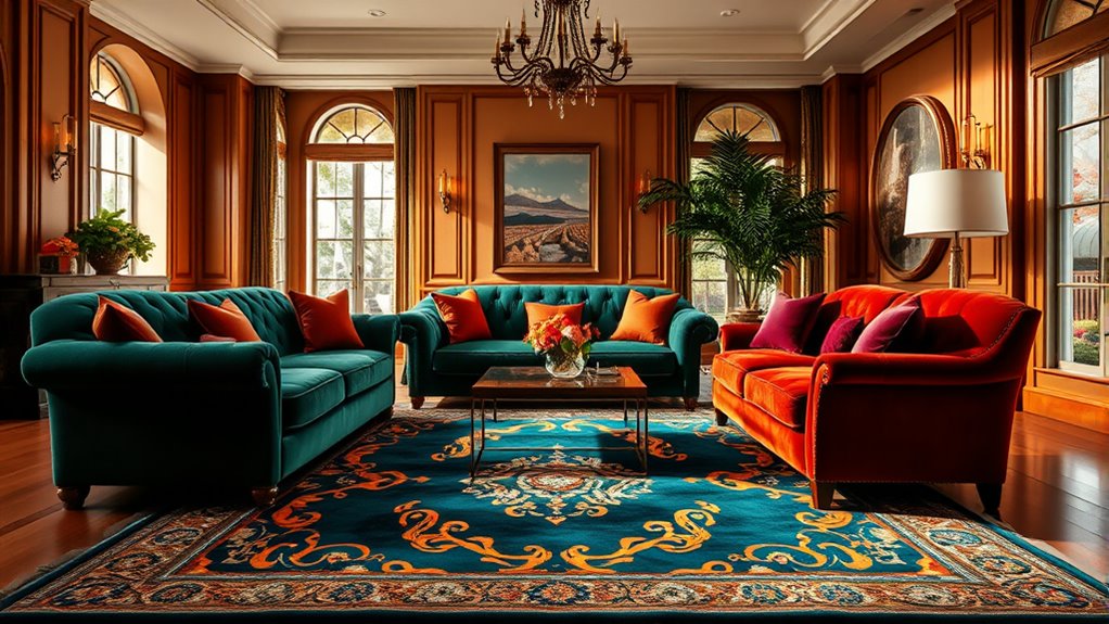
Ruby-Toned Rugs: Creating Dramatic Contrasts With Blues and Turquoises
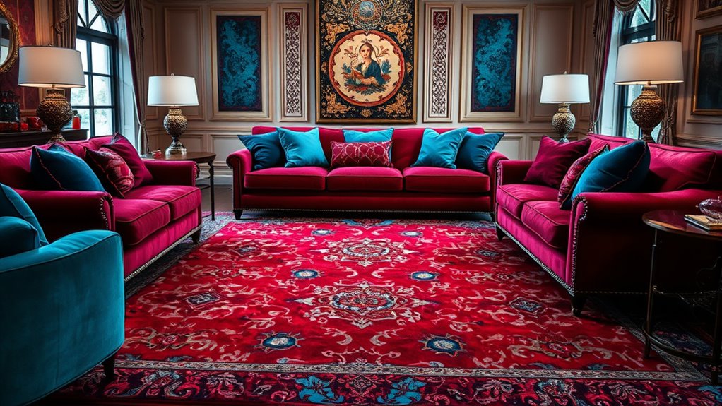
Ruby-toned rugs instantly create a bold, dramatic focal point in any room, especially when paired with deep blues and vibrant turquoises. The intense red hue contrasts sharply with cooler tones, making your space feel lively and sophisticated. To maximize this effect, choose furniture and accessories in complementary shades—navy, cobalt, or turquoise—to enhance the visual impact. Keep walls neutral or softly tinted to let the rug stand out without overwhelming the room. Incorporate metallic accents like gold or brass to add a touch of elegance and warmth. This combination works beautifully in living rooms, bedrooms, or even entryways where you want to make a striking impression. With careful balance, your ruby rug can transform the space into a dynamic, eye-catching environment. Additionally, understanding color harmony principles can help you create more balanced and aesthetically pleasing decor schemes.
Tips for Balancing Bold Jewel Tones With Complementary Accents
To effectively balance bold jewel tones with complementary accents, focus on integrating smaller, understated accessories that highlight the vibrancy without overwhelming the space. Use neutral-colored throw pillows, rugs, or curtains to create a calm backdrop, allowing the jewel tones to stand out. Incorporate metallic accents like gold or silver, which add sophistication without competing for attention. Keep patterns subtle—think small-scale prints or simple textures—so your bold hues remain the focal point. When choosing artwork or decorative objects, opt for pieces that subtly echo your jewel-tone palette or feature complementary shades. By carefully selecting these accents, you’ll achieve a harmonious look that enhances your jewel-tone rugs without making the space feel cluttered or chaotic. Regularly assessing and rotating accessories can help maintain a balanced and fresh aesthetic.
Frequently Asked Questions
How Do I Choose the Right Jewel-Tone Rug for My Room?
When selecting a jewel-tone rug for your room, consider your existing color palette and the mood you want to create. You should choose a shade that complements your walls and furniture, making sure it adds vibrancy without overwhelming the space. Think about the room’s lighting, as it can affect how the colors appear. Ultimately, pick a jewel tone that reflects your style and enhances your room’s overall harmony.
Can Complementary Color Schemes Work in Small or Cluttered Spaces?
Think of your space as a tiny garden; color choices are the delicate blooms. Complementary schemes can work in small or cluttered rooms if you’re careful. Use them as pops of bold color against neutral backgrounds, creating focal points that draw the eye away from clutter. Keep the palette simple and balanced; too many contrasting hues might overwhelm. With thoughtful placement, your room can feel lively without feeling cramped.
What Lighting Enhances Jewel-Tone Rugs’ Vibrant Colors?
To make jewel-tone rugs pop, you should use lighting that highlights their rich colors. Bright, warm LED lights work well, as they bring out the vibrancy without overwhelming the space. Avoid harsh, cool lighting that can dull the hues. Instead, opt for adjustable fixtures or layered lighting, like sconces and lamps, to create a cozy ambiance and enhance the depth and brilliance of your jewel tones.
Are There Any Color Combinations to Avoid With Jewel-Tone Rugs?
When choosing color combinations for jewel-tone rugs, you should avoid pairing them with overly similar shades that create a dull look or clash harshly. Steer clear of colors that compete for attention, like bright oranges with deep reds, which can overwhelm the space. Instead, opt for balanced contrasts or neutrals to let your rug stand out without creating visual chaos. This way, your decor remains harmonious and stylish.
How Do I Maintain the Vibrancy of Jewel-Tone Rugs Over Time?
Think of your jewel-tone rug as a vibrant gemstone that needs gentle care to keep shining. To maintain its vibrancy, avoid direct sunlight which can fade colors over time. Regularly vacuum and clean spills immediately to prevent staining. Rotate the rug occasionally to ensure even wear. Using a high-quality rug pad prevents slipping and uneven fading. With consistent care, your rug will stay as dazzling as the day you brought it home.
Conclusion
By exploring these jewel-tone rug pairings, you can transform any space into a vibrant, harmonious retreat. Imagine the stunning contrasts and accents you could create—don’t you want your home to reflect your bold style? Embrace the power of complementary colors and let your personality shine through with striking combinations. Ready to start your interior design adventure? Your perfect jewel-tone scheme is just a color away!